How to Find and Curate Eye-Catching Website Photos

On the list of activities that seem fun but aren’t, right behind sleeping in the top bunk and driving on the freeway in a convertible, is sourcing photos for your website.
Anyone who has set out to quickly find a few great stock photos for their website inevitably find themselves hours later, drowning in tab-fuls of options, but no closer to finding ‘the one’.
If you’ve ever wondered how to find stock photos that look like they ‘belong’ together, how to save time sourcing photos or where to unearth those non-corny gems, keep on reading to learn our 5 step system for choosing photos, without losing your sanity.
Step 1: Plan your website
While it’s tempting to dive straight into building and creating your website, if you don't have a plan your website is likely to confuse way more customers than it converts. So, before you begin your image search, you’ll want to arm yourself with the following—
- Your website copy (what you want your website to say): This doesn’t need to be fancy, a Google doc or Word doc is ideal.
- Your website wireframe: This is a really simple mud map or sketch that shows what is being placed where on each page. If you are starting with a template and don’t plan to change the layout and pages, this can serve as your wireframe.
These documents are essential for planning your photos, so don’t skip this first step!
Step 2. Define your style
Whenever we create a visual identity for our customers, we outline their photography style so they know exactly what to look for in their photos. If your brand designer hasn’t done this for you, follow the next steps to do it yourself.
First, let’s list out some of the features you would like to see in all of your photos. These are the broad brush strokes that define your brand photos as a collection. By defining these here, we’re going to be able to narrow down our search and save time in step 4.
Mood & lighting
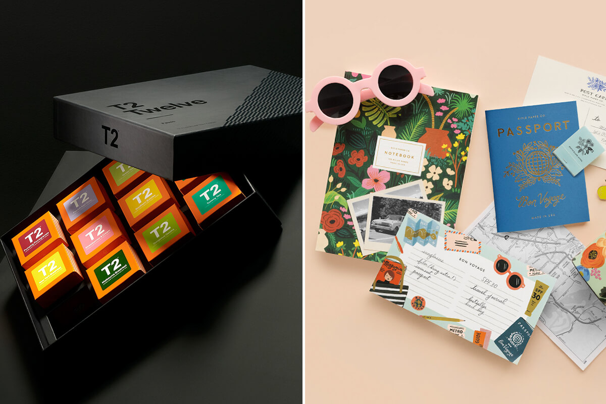
Do you want your photos to be bright and well lit, or are moody shadows and lighting a part of your vibe? For example, T2 achieve a moody, earthy feel in their photography, while Rifle Paper Co keep things light and bright.
Props & environments
What kind of environments, props, textures and locations fit with the brand mood and style you’re trying to achieve? A fun way to answer this question would be to create an ideal home or office for your brand.
- Where is it located—city, country, suburbs?
- What’s nearby—The beach, local cafes or a huge nature reserve?
- What materials and objects commonly feature— concrete, wood, brick, glass, plants, technology, art etc.?
Colours
What are your brand colours and how do these feature in your photos? Do you use really vibrant, saturated hues like Auriele Cerise, or more muted pinks and greys like thankly? Anthropologie use tints of their brand colours in the backgrounds of their photos to keep things looking cohesive, and one look at Arielle Vey’s instagram feed shows sea of orange, pink and blue.

Models
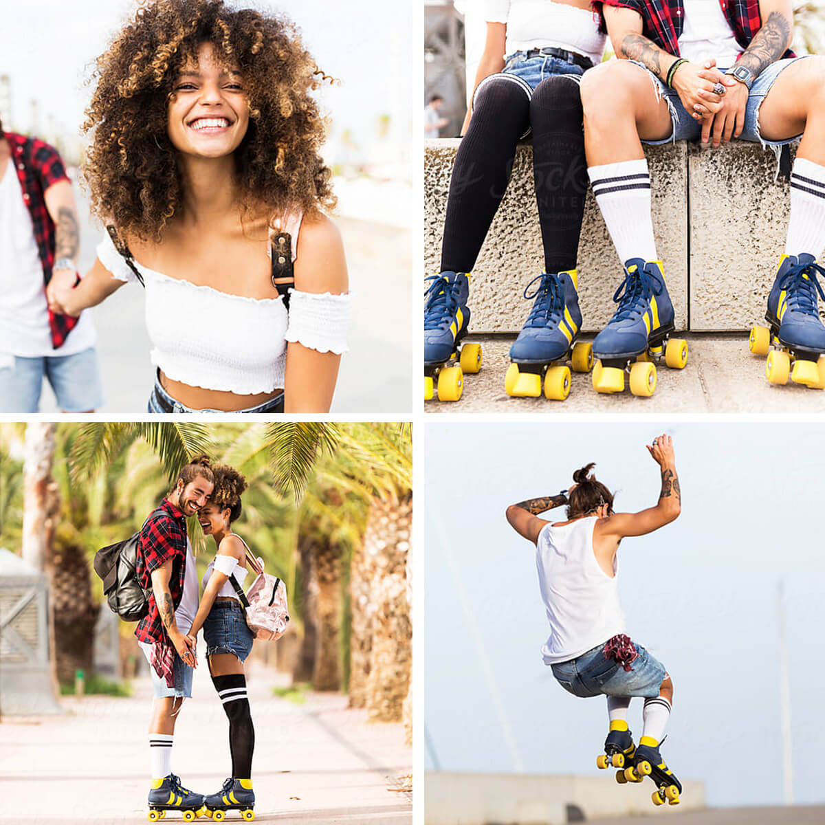
What types of people typically feature in your photos? Usually your models are a reflection of your ideal customers— so narrow in on age, gender, lifestyle, fashion style.
Step 3. Create your image list
Now you’re ready to create your image shopping list. Here, you’ll map out all your image requirements and hone in on exactly what what you’re searching for.
Using your copy and website wireframe documents from step 1, you’re going to create a list of all the images you’ll need for each page, and their shape and size (approximately). Then, you’re going to jot down the types of images (including the subject and environments) that would be appropriate for that section, depending on what you are trying to communicate. As you already have your style rules defined, the details in this list should be specific to each photo.
The resulting image list should be a list of exactly what you need, as well as some initial ideas for what to search for or what needs to be produced.
Step 4. Find or create
Now that you have your image list, you should be able to make an informed decision about whether you need to book in a custom photo shoot or you’ll use stock photos.
Custom shoots or stock photos?
While many businesses opt to purchase stock photos, depending on the number of photos you require, your photographer fees and whether you need to pay for location costs and models, sometimes a custom photo shoot can turn out to be a similar cost to stock. The perks of the custom shoot is that you have completely original photos, that look like they belong together, so it can be a great option and is worth investigating to see if it's the right fit for you.
Stock site search tips
If you’re opting for stock photos, it’s time to begin the hunt. Here are our best search tips—
Start with a good quality stock library
Not all stock sites are created equal, and you don’t want to waste your time trawling through low quality, cheesy photos. If you’re looking for free photos, in my opinion Unsplash is the kingpin here, but we've also created a big list of lots of free stock sites over here.
While the free sites are great, more often than not, you’ll need to turn to paid sites to find the variety you need for your website. For good quality stock photos, we really like Stocksy. Adobe Stock and iStock are go-tos aswell, or Getty if budget isn't a concern or you're looking for a shot of someone famous. If you’re after flatlays or office spaces, Haute Stock or SC Stockshop have your back.
Be smart with your keywords
Just like google, if you don’t find what you’re looking for with your first keyword search, you can try related words or add in some more descriptive words. There is no formula for this, so it’s a bit of trial and error. If I find a good image, I often look at the keywords that it has been tagged with for some suggestions on what to search for next.
Use the filters & suggestions
Most of the good stock sites have filters you can use to narrow your search— such as whether the photo includes people or not, the colours in the photo, the depth of field and even the gender of the subjects. This is why it is so helpful to have already outlined your imagery style like we did in step 2. I highly recommend making use of these to narrow your search and weed out irrelevant photos.
If you find a photo that's pretty close to perfect, but the photo composition or model is not quite right, some stock sites also allow you to search for similar photos, view more photos from the same shoot, or allow you to view all work by that photographer, which can also help you to dig up some great photos.
Selecting the winning images
Once you’ve found some great options, be sure to download the watermarked sample or preview version of the photo and try it out on your website before you buy it. Sometimes a photo that looks perfect might not be the right fit once you see it in context, so that’s why having a few options is always a good idea.
If you're narrowing down your options and are having trouble deciding, I always recommend opting for the image that best communicates the end value of what you're trying to sell. While I’m all for being creative, you only get a few seconds to tell your website visitors your story, and you don’t want to leave room for subjectivity. I've found that people tend to respond more favourably to images of other people, rather than objects or landscapes. No matter the industry, we’re all selling our customers a better version of themselves, so don’t be afraid to show this end result.
Step 5. Edit and export
Once you have your final picks, more often than not, it’s this final editing step that makes them look like they belong together.
Adjust White Balance & Colours
If you have photo editing software such as Photoshop or Lightroom, I usually put all my photos into one document so I can see them all side-by-side. Then, I can make selective colour adjustments to ensure they all use similar tones. If the same model is used across several photos, then I’ll adjust the reds and yellows in the image to ensure they look consistent across the website. You can see the difference before and after editing below.

Add Filters & Effects
If, back in Step 2, you decided your brand style includes certain filters or effects, then you can add them in this step. For example duotone style (think spotify) or black and white. Adding a filter or effect to all your photos is a simple way to ensure your imagery looks cohesive, no matter where it is sourced.
Once you’re done editing, compress and resize those suckers and you’re ready to upload them to your new website. Remember to create an image library on your drive or server with all your original and edited photos so you can access them whenever you need to.
Image sourcing can take a bit of time, but personally, I think it’s definitely worth it to achieve the right look and feel on your website. I hope this step-by-step guide has helped you to select your new website photos.
What are your best stock image sites or search tips? Tell me in the comments, and don’t forget to share this article if you know someone who it could help!
Continue Reading
